Ashwin Malshe
html_notebook
Many students face difficulties in linking RStudio and Github. This post shows a workaround using Github Desktop application.
This is an old post about installing R and RStudio. It still works.
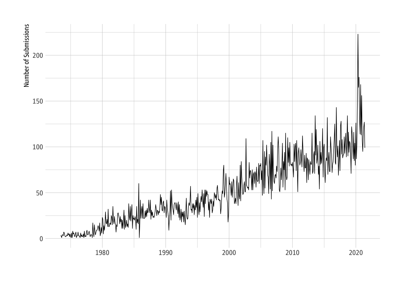
This post is a tidytuesday post. See the post below for the data source.
Robert Kiyosaki is a legendary peronal finace guru, who has sold millions of copies of the book Rich Dad, Poor Dad. Yet, he is also a terrible predictor of the stock market movements!
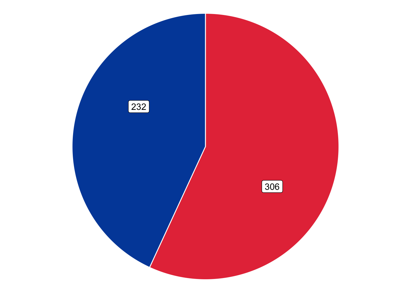
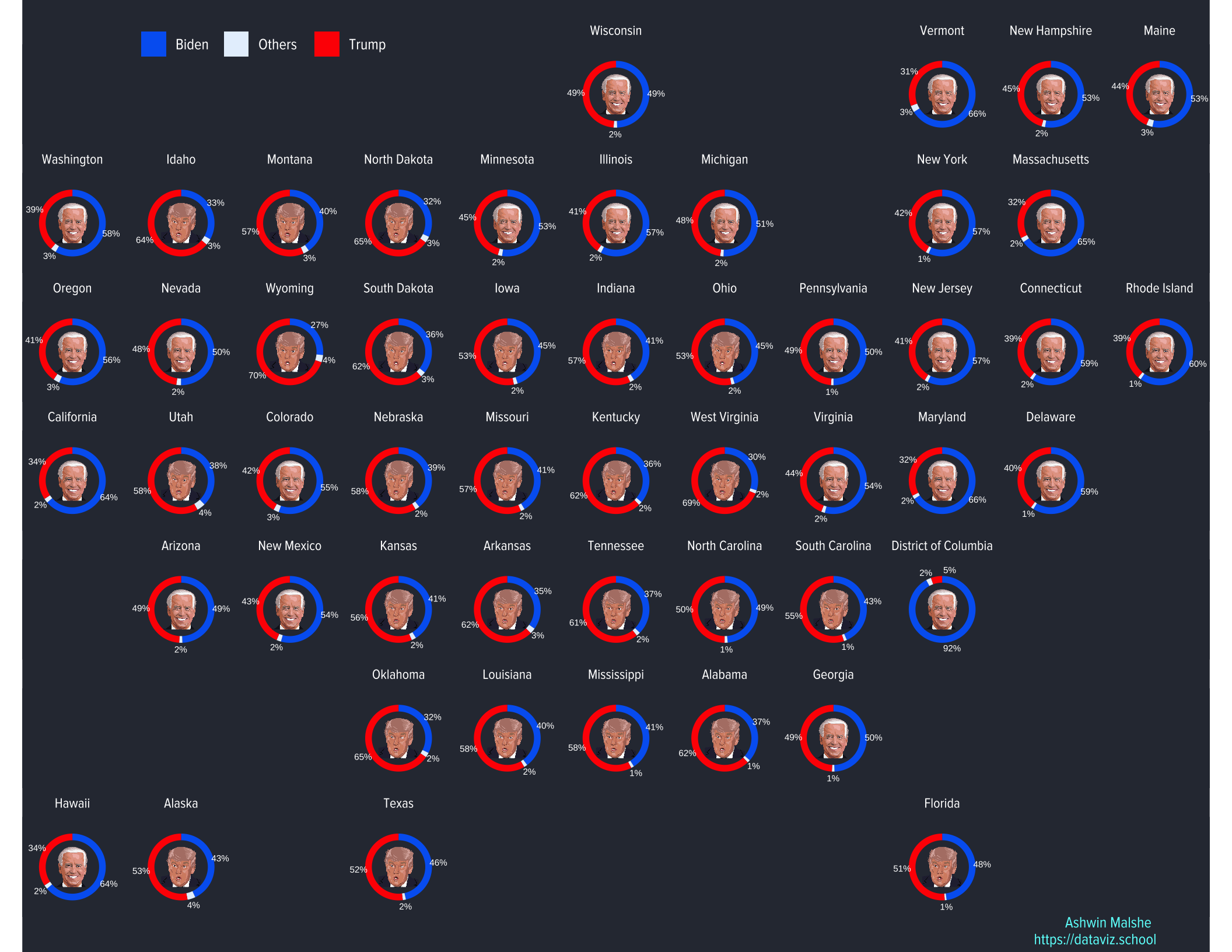
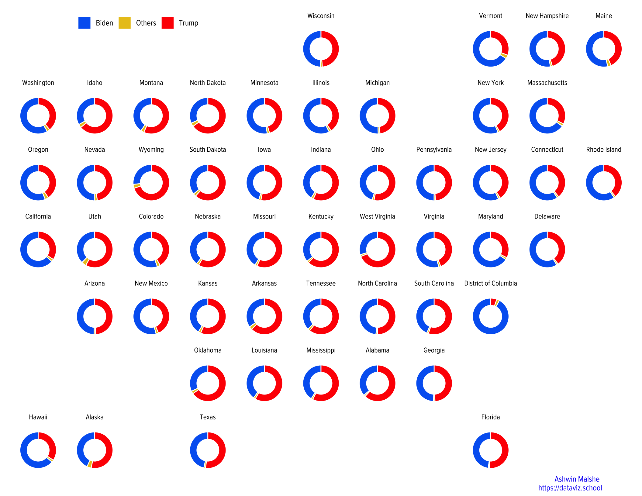
I make pie charts and donut charts in ggplot2 using a combination of a bar plot and polar coordinates. This works fine but polar coordinates prevent using any other geoms or annotations that need Cartesian coordinates. For example, annoatation_raster doesn’t work with polar coordinates. ggforce solves this issue.
In this post, I recreate the donut chart overlaid on geo facets. Based on a friend’s feedback, I now add pictures of winners of each state.
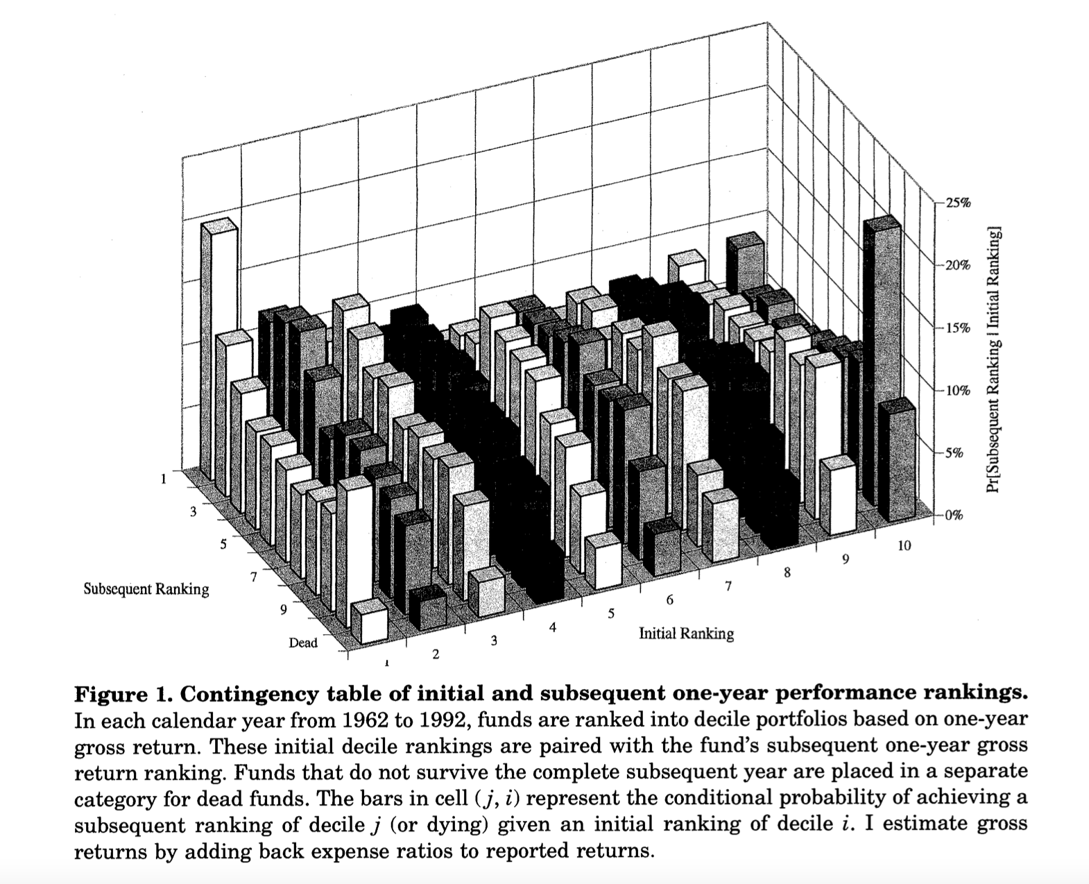
In this article, I reproduce Figure 1 from Mark Carhart’s classic 1997 Journal of Finance article titled “On Persistence in Mutual Fund Performance”. The visualizations are created using highcharter and echarts4r packages. It is an interactive bar plot that shows that there is a very low persistence in the mutual fund performance.
How to combine a donut chart with geofacets in R.
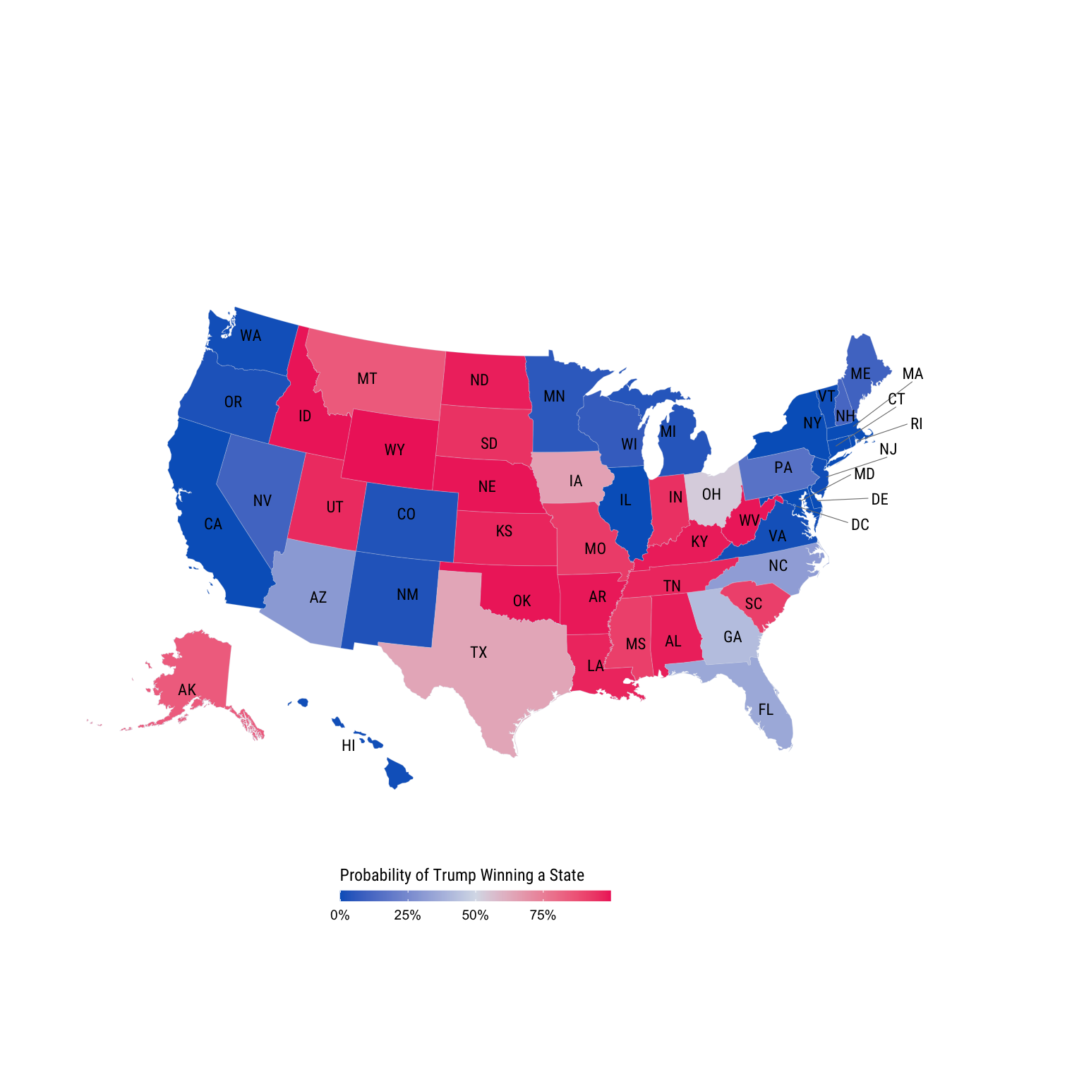
I show how to create a election map using ggplot2