Before you begin, note that, in the header, the output format of this document is html_notebook. When you save this file, it automatically creates another file with the same file name but with .nb.html extension in the same directory. This is the file you will submit as your homework solution along with the .Rmd file.
Warnings:
- Don’t delete the
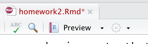
nb.htmlfile. - Don’t
knityour.Rmdfile tohtml. If you want to look at the output, just open thenb.htmlin the browser. Alternatively, click on the “Preview” button on top of the document:
If you delete nb.html file, you may have to create a new .Rmd file and restart from there. If you knit your .Rmd file to html, you will not be able to retain any of the interactivity in the plots. This means the TA will not be able to grade you!
The objective of this homework is to give you more practice on interactive visualizations using plotly and highcharter.
As always, recreate these visualizations exactly. Q1 uses plotly while Q2-Q5 use highcharter.
Q1 (3 points)
Use mpg data set from ggplot2 to create a static visualization and then use ggplotly() to create a limited interactive plot.
Hint: You will need to supply only frame. No ids used.
For the next four questions, you will use highcharter.
Q2 (3 points)
This example creates a heatmap similar to the one shown here.
Use mpg data and hchart() function. We want to create a heatmap of average highway mileage for different class and cyl. This plot removes all the observations with five cylinders or with 2seater class. Also note that I am treating cyl as a character (string) variable. This is essential for creating this plot.
I am using hc_theme_538(). Furthermore, the default color in the heamap is blue, which I changed using hc_colorAxis() function that I used in the Week 10 heatmap.
Q3 (3 points)
In the above plot, the tooltip shows confusing information. Below, I modified the tooltip to present more information. The code is not at all complicated and relies on the tooltip code we used in Week 10.
Next, I removed the X axis title and modified Y axis title.
Finally, I added a title to the plot. Note how I used four different emojies related to cars. It doesn’t matter which car emojis you use as long as they are related to automobiles.
Q4 (3 points)
For this example, use a randomly selected subset of diamonds data set from ggplot2:
set.seed(2020)
d1 = diamonds[sample(nrow(diamonds), 1000),]
Next use d1 to create the following plot.
I have used hc_theme_flat() for this plot. Please use this theme for your plot too! You can add a theme to the plot using hc_add_theme() function. Wherever the word diamond appeared in the plot, I replaced it with the diamond emoji.
Point colors in this graph are mapped to clarity. Check out all the variables in this data set by typing ?diamonds in the console.
Q5 (3 points)
Using economics dataset from ggplot2, recreate the following line graph. Learn more about the variables in the dataset by typing ?economics in the console. Here, the Y axis is plotting unemployment.
I used hc_theme_economist(). You can use any theme you want. You can check out the themes here.
Bonus plot (Not graded)
This is the same plot as above except if you hover mouse pointer over the peak of unemployment, the tooltip will show more information. Once again, this is a simple trick and doesn’t require any advanced coding.