load(url("https://github.com/ashgreat/DA6233/blob/master/sim-elect.rda?raw=true"))In this post, I will show you how to make a map using ggplot2. For this, I am going to use an excellent post by Andrew Gelman.
Fivethirtyeight daily updates the probabilities of Trump and Biden wins based on multiple polls and their own model.1 They also make available their simulation outcomes as a json file. Next, I merged the cleaned simulation data with US map data. I will create a separate post to show you how to read, clean, and merge these data sets.
Read the data sets and load packages
I have saved all the required data sets as a .rda file on Github. You can directly read them into your R code without saving it first.
I will use ggrepel package to make sure that the state labels don’t overlap. If you don’t have this package installed, run install.packages("ggrepel") in the RStudio console.
library(tidyverse)── Attaching packages ─────────────────────────────────────── tidyverse 1.3.2 ──
✔ ggplot2 3.4.3 ✔ purrr 1.0.2
✔ tibble 3.2.1 ✔ dplyr 1.1.3
✔ tidyr 1.3.0 ✔ stringr 1.5.0
✔ readr 2.1.3 ✔ forcats 0.5.2
── Conflicts ────────────────────────────────────────── tidyverse_conflicts() ──
✖ dplyr::filter() masks stats::filter()
✖ dplyr::lag() masks stats::lag()library(ggrepel)Making the map
Now we are ready to make the map. We will use trump_wins data set. This data set has results of 40,000 simulations. Each simulation shows whether Trump will win or lose a state. There are results for 50 states and Washington D.C. There are five more results for, what I think is, regional data. We will not use those results.
Trump probability of winning each state is simply the column means of this data set. In the following code the first four lines calculate the probabilities and restructure the data so that it is easier to merge with the data on maps.
dt <- trump_wins %>%
  summarize(across(everything(), mean)) %>%
  mutate(across(everything(), ~ round(.x * 100, 2))) %>%
  pivot_longer(cols = everything(), names_to = "state_abb", values_to = "prob") %>%
  inner_join(select(state_names, -lat, -long), by = "state_abb") %>%
  inner_join(fifty_states, by = c("state_low" = "id"))
Finally, we create a map using dt. The labels of the states are split into two groups. Many northeastern states show up small on the map so their names are no readable easily. Therefore, we need to show them a little bit away from the map. For this we will use geom_text_repel() function from ggrepel package.
dt %>%
  ggplot(aes(x = long, y = lat)) +
  geom_polygon(aes(group = group, fill = prob), color = "#d8dee9", linewidth = 0.05) +
  geom_text(data = filter(state_label,
                          !state_abb %in% c("MA", "RI", "CT", "NJ", "DE", "DC", "MD")),
            aes(label = state_abb),
            size = 3, hjust = 0.5, family = "Roboto Condensed") +
  geom_text_repel(data = filter(state_label,
                                state_abb %in% c("MA", "RI", "CT", "NJ", "DE", "DC", "MD")),
                  aes(label = state_abb),
                  nudge_x = 5,
                  segment.size  = 0.2,
                  segment.color = "grey50",
                  direction     = "y",
                  size = 3,
                  hjust = 0.5,
                  family = "Roboto Condensed") +
  coord_map(projection = "albers", lat0 = 39, lat1 = 45) +
  scale_fill_gradient2(low = "#0063c4",
                       mid = "#d8dee9",
                       high = "#ef2e69",
                       midpoint = 50,
                       labels = c("0%", "25%", "50%", "75%", "100%"),
                       guide = guide_colorbar(barwidth = 10,
                                              barheight = 0.4,
                                              title.position = "top")) +
  labs(fill = "Probability of Trump Winning a State") +
  ggthemes::theme_map() +
  theme(legend.position = c(0.3, -0.2),
        legend.direction= "horizontal",
legend.title = element_text(family = "Roboto Condensed")) 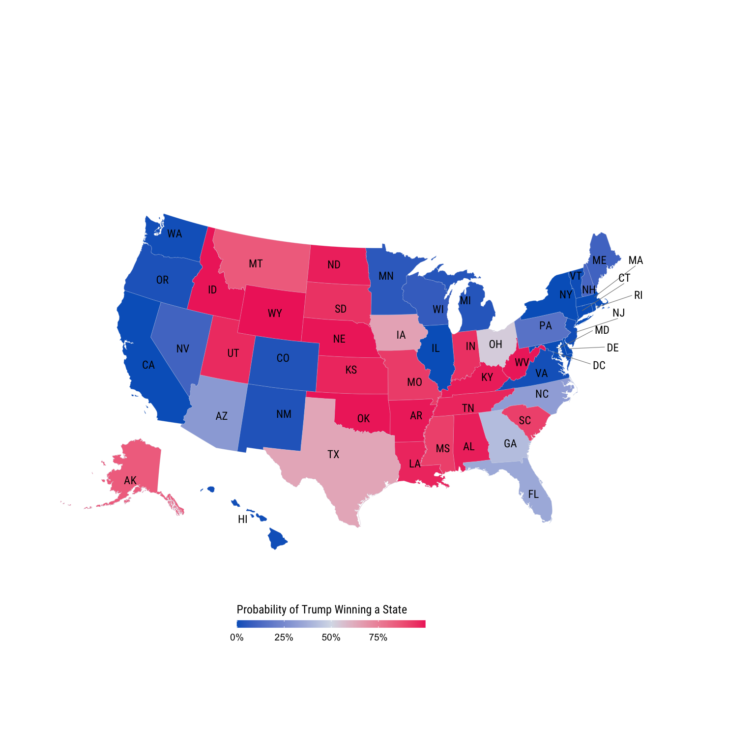
Footnotes
You can check out the maps and other information on their website: https://projects.fivethirtyeight.com/trump-biden-election-map/↩︎