dt <- tibble(candidate = c("Joe Biden", "Donald Trump"),
electoral_votes = c(306, 232))In the previous post, I created a geofacet of donut charts using coord_polar() function from ggplot2. You can also create pie charts in the same way. However, there are two issues with this method.
The method is not intuitive. Whether you will get a pie chart or a donut chart depends on
xlim()which has no apparent connection to how the resulting plot will look like. This is confusing irrespective of how long you have been usingggplot2.ggplot2can handle only one coordinate system per plot. This means, you can’t have polar coordinates and Cartesian coordinates in the same plot. This makes sense because these are two totally different coordinate systems. However, this creates problems when you want to use layers that belong to separate coordinate systems. For instance, it is impossible to overlay images on top of the donut charts. This is becauseannoate_raster()inggplot2, which is used to insert images, doesn’t work with polar coordinates. It needs Cartesian coordinates. On the other hand, the donut charts were created using polar coordinates. Otherwise, it is just a bar plot in Cartesian coordinates!
In this post I show you how to overcome both these issues by using a relatively unknown package called ggforce. The developer of this package, Thomas Lin Pedersen, is in the core development team for ggplot2. He is also the author of gganimate and patchwork packages.
We will use geom_arc_bar() function from ggforce to create pie charts and donut charts. Since it uses Cartesian coordinate system, including images in the plot is super simple.
Data preparation
Let’s create a simple data set with electoral votes of Biden and Trump. I am using this example because you are familiar with the general idea from my previous post.
Pie chart
Let’s make a pie chart first. With two categories, a pie chart is not a bad choice for visualization. There is not a lot to explain in the code below. Both pie and donut charts are circles. To plot a circle, we need only three parameters. We need the x and y coordinates of the center of the circle and we need the radius. A donut chart requires one more parameter. Imagine a donut as an image with two concentric cirles. So for a donut chart, we need to provide the radius of the inner circle as well.
geom_arc_bar() can be used for making pie charts and donut charts. It requires an aes() function with the following arguments for positioning circles:
x0: X coordinate of the center of the circle
y0: Y coordinate of the center of the circle
r0: Radius of the inner circle
r: Radius of the outer circle
The other arguments, amount and fill are self explanatory. The variable mapped to amount will decide the size of the pie. In Tableau terminology, this will be mapped to the angle of the pie or donut.
stat = "pie" specifies the that we want a pie chart. When r0 = 0, we get a pie chart. When r0 > 0 we get the inner circle, which results in a donut chart.
Apart from geom_arc_bar() you also need coord_fixed(). This is required to make sure that there is no scaling along the X and Y axis and you indeed get a circle. Otherwise you will get an oval rather than a circle.
Here I set x0 and y0 both to 0. Of course, this is not a requirement and it will change based on the complexity of the visualization you are making. It’s just the position of the circle on X and Y axes. Next, I set r = 1. Once again, it depends on the context and complexity of your visualization.
ggplot(dt) +
  geom_arc_bar(aes(x0 = 0, y0 = 0, r0 = 0, r = 1,
                   amount = electoral_votes,
                   fill = candidate),
               stat = 'pie',
               color = "white") +
  geom_label(x = c(0.5, -0.5), y = c(-0.3, 0.3), aes(label = electoral_votes)) +
  scale_fill_manual(values = c("#004BA8", "#e63946")) +
  theme_void() +
  coord_fixed() +
  theme(legend.position = "none")
Warning: Using the `size` aesthetic in this geom was deprecated in ggplot2 3.4.0.
ℹ Please use `linewidth` in the `default_aes` field and elsewhere instead.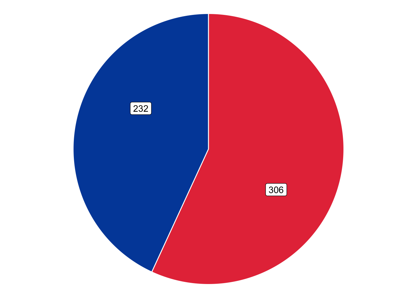
This is a nice pie chart. I positioned the labels such that they are on a roughly 135º line.
Donut chart
Now let’s make the donut chart. The code below looks almost the same as the previous code except we have set r0 = 0.8. You will also have to adjust the label positions, which I did by doing some trial and error.
ggplot(dt) +
  geom_arc_bar(aes(x0 = 0, y0 = 0, r0 = 0.8, r = 1,
                   amount = electoral_votes,
                   fill = candidate),
               stat = 'pie',
               color = "white") +
  geom_label(x = c(0.85, -0.85), y = c(-0.3, 0.3), aes(label = electoral_votes)) +
  scale_fill_manual(values = c("#004BA8", "#e63946")) +
  theme_void() +
  coord_fixed() +
  theme(legend.position = "none")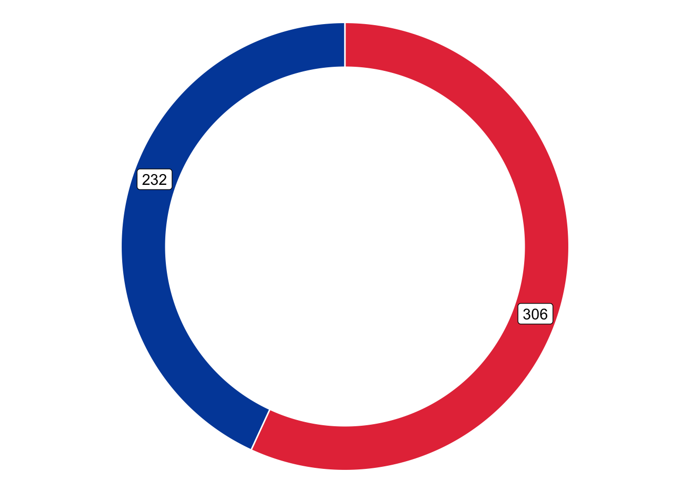
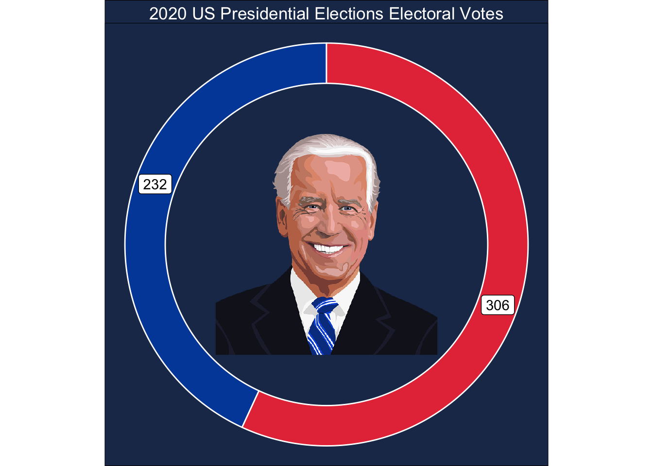
Donut chart with image
The two graphs above solved the first issue I identified — these two graphs are much easier and intuitive to make compared to using coord_polar(). Next, let’s include an image in the donut chart. I recommend finding an image using Google Images, Pixabay, or Unsplash. I also found that making the image square makes adding it in the donut chart much easier. You can do it in Microsoft Paint in Windows and Preview on Mac.
ggplot(dt) +
  geom_arc_bar(aes(x0 = 0, y0 = 0, r0 = 0.8, r = 1,
                   amount = electoral_votes,
                   fill = candidate),
               stat = 'pie',
               color = "white") +
  geom_label(x = c(0.85, -0.85), y = c(-0.3, 0.3), aes(label = electoral_votes)) +
  annotation_raster(png::readPNG(here::here("Images", "biden-pixabay-square.png")),
                    xmin = -0.55, xmax = 0.55, ymin = -0.55, ymax = 0.55) +
  scale_fill_manual(values = c("#004BA8", "#e63946")) +
  theme_void() +
  coord_fixed() +
  labs(title = "2020 US Presidential Elections Electoral Votes") +
  theme(legend.position = "none",
        plot.title = element_text(color = "white", hjust = 0.5),
        plot.background = element_rect(fill = "#1d3557"),
        panel.background = element_rect(fill = "#1d3557"),
        panel.border = element_blank())