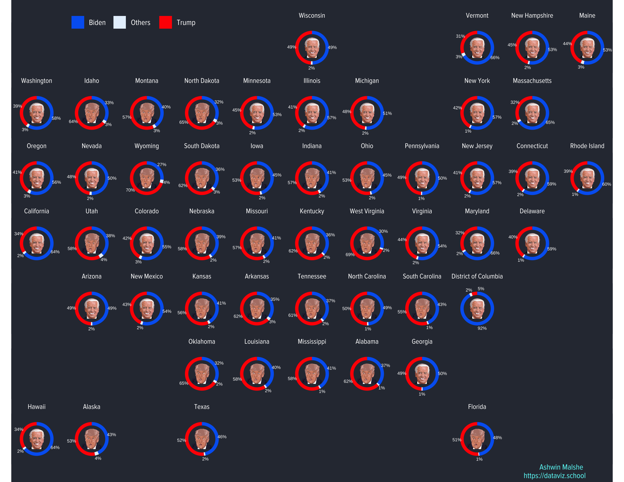
For the background and more details on this plot, please check out my earlier blog post: https://dataviz.school/posts/2020-11-20–us-election-donut/
Getting the data
As of the date of this writing (21st November 2020), the results of the US Presidential elections have not tallied. The counting is still going on in a few states. However, it is unlikely that the results will change significantly from this point onward. I decided to get data from this Github repo, which scrapes data from NYT. The data is at county-level: https://github.com/favstats/USElection2020-NYT-Results
Final plot
This is the plot I created. I have used Biden and Trump pictures from www.pixabay.com. Check it out for a lot of free, attribution-free images. I also tried using Trump and Biden icons but it did not work well. I got Trump and Biden icons from here respectively:
These are free to use with attribution.
Code to create the plot
Here is the code to recreate these plots. Note that I am assuming that you are using the code to prepare data from my previous post.
The main challenge in creating this plot is mismatch of the coordinate system. The donuts are created using polar coordinates. It’s not possible to overlay images on top of those donuts in ggplot2. I decided to use a workaround, which I have successfully used in the past to create dataviz for my wife. I first created two separate plots. First plot is the main donut chart which I created previously. The second plot is just a facet plot of Biden and Trump images. Next I used cowplot package to overlay these two plots on top of each other. It may sound pretty easy but it took me a lot of time to align those two plots perfectly. The key was to use coord_fixed() in the second plot.
Create a data set with images
Here I am creating a data set with a column containing links to either Biden or Trump images. I am also making sure that I retain the winner in each state and DC. The resulting data has 51 rows. Note that in the plot I use image2 variable to overlay images. If you instead want the icons, use image in geom_image() in the code below.
dt3 <- dt2 %>%
  arrange(state, -votes) %>%
  group_by(state) %>%
  filter(row_number() == 1) %>%
  ungroup() %>%
  mutate(image = case_when(Candidate == "Biden" ~ "https://github.com/ashgreat/dataviz-blog/raw/main/Images/joe-biden.png",
                           Candidate == "Trump" ~ "https://github.com/ashgreat/dataviz-blog/raw/main/Images/donald-trump.png"),
         image2 = case_when(Candidate == "Biden" ~ "https://github.com/ashgreat/dataviz-blog/raw/main/Images/biden-small-pixabay.png",
                           Candidate == "Trump" ~ "https://github.com/ashgreat/dataviz-blog/raw/main/Images/trump-small-pixabay.png")
         )
Create donut charts
This code is basically copied from the previous post.
g3 <- dt2 %>%
  group_by(state) %>%
  arrange(Candidate) %>%
  mutate(ymax = cumsum(per_votes),
         ymin = ifelse(row_number() == 1, 0, lag(ymax)),
         ypos = (ymin + ymax) / 2) %>%
  ungroup() %>%
  ggplot(aes(ymin = ymin, ymax = ymax, xmin = 3, xmax = 4)) +
  geom_rect(aes(fill = Candidate)) +
  geom_text(x = 5,
             aes(y = ypos,
                 label = formattable::percent(round(per_votes, 2), digits = 0)),
             size = 2, color = "white") +
  coord_polar(theta = "y") +
  facet_geo(~state) +
  scale_fill_manual(values = c("#0066f2", "#e6f1fd", "#ff0000")) +
  theme_void()+
  xlim(-1, 5) +
  labs(caption = "Ashwin Malshe \nhttps://dataviz.school",
       subtitle = " ") +
  theme(legend.text = element_text(family = "proxima", size = 10, color = "white"),
        legend.title = element_blank(),
        legend.direction = "horizontal",
        legend.position = c(0.2, 1),
        plot.caption = element_text(family = "proxima", size = 10, hjust = 0.95,
                                    margin = margin(0, 0, 5, 0, "pt"),
                                    face = "bold", color = "#69fffb"),
        strip.text = element_text(family = "proxima", size = 9, color = "white",
                                  margin = margin(0, 0, 5, 0, "pt")),
        strip.background = element_blank(),
        plot.background = element_rect(fill = "#2e3440", color = NA),
        panel.background = element_rect(fill = "#2e3440", color = NA))


# Print the plot

g3
Create the plot of images
This is the plot that will be layered on top of the donut chart. Note geon_image() from ggimage package.
g4 <- ggplot(dt3) +
  facet_geo(~state) +
  ggimage::geom_image(aes(x = 0.5, y = -1, image = image), size = 0.5) +
  theme_void()+
  xlim(0, 1) +
  coord_fixed() + # This is critical!
  theme(
        strip.background = element_blank(),
        strip.text = element_blank(),
        panel.background = element_blank(),
        plot.background = element_blank())
Superimposing the two plots
This was easy. I just layered g4 on g3 using align_plots() from the fatnastic package cowplot. Finally, I plotted them and saved in an object g5. Note that if you use the same font as the one I used here, cowplot will generate many error messages. Ignore them as it won’t affect your output.
aligned_plots <- cowplot::align_plots(g3, g4, align="hv", greedy = FALSE)

g5 <- ggdraw(aligned_plots[[1]]) +
  draw_plot(aligned_plots[[2]])
I hope you enjoyed this post!