dt <- readr::read_csv("https://bit.ly/2UO2Zyp")There are many different ways people have visualized US presidential elections results on the US map. One critical drawback in many of these visualizations is that they show only the results for the winners. I wanted to show the vote percentages for Biden, Trump, and other candidates. These can be easily captured using a pie chart or a donut chart. However, superimposing the charts on the US map is difficult because the sizes of the states vary quite a lot. So I decided to use the fantastic geofacet package, which makes this task easy.
Getting the data
As of the date of this writing (21st November 2020), the results of the US Presidential elections have not tallied. The counting is still going on in a few states. However, it is unlikely that the results will change significantly from this point onward. I decided to get data from this Github repo, which scrapes data from NYT. The data is at county-level: https://github.com/favstats/USElection2020-NYT-Results
I am reading the data directly into R.
Cleaning up the data
I clean up the data in multiple steps using dplyr:
- Get total votes and absentee votes for all the contentstansts other than Trump and Biden.
statenames have-in place of a space. For instance, New York is written “as new-york”. Replace all the hyphens with spaces.- Use title case for all the state names. This screws up District of Columbia by capitalizing “O” in of. Fix that.
- Summarize the votes at the state level.
- Reshape the data using
pivot_longer. This will lead to only five columns. - Finally, calculate the percentage votes.
Absentee votes for some states were negative so I decided not to use absentee votes in any visualization.
# Load the libraries
pacman::p_load(tidyverse, showtext, geofacet)

dt2 <- dt %>%
  mutate(
         Others = votes  - (results_trumpd + results_bidenj),
         Others_ab = absentee_votes - (results_absentee_trumpd + results_absentee_trumpd),
         state = stringr::str_replace_all(state, "-", " "),
         state = stringr::str_to_title(state),
         state = ifelse(state == "District Of Columbia", "District of Columbia",  state)
         ) %>%
  group_by(state) %>%
  summarize(Trump_votes = sum(results_trumpd, na.rm = TRUE),
            Trump_abvotes = sum(results_absentee_trumpd, na.rm = TRUE),
            Biden_votes = sum(results_bidenj, na.rm = TRUE),
            Biden_abvotes = sum(results_absentee_bidenj, na.rm = TRUE),
            Others_votes = sum(Others , na.rm = TRUE),
            Others_abvotes = sum(Others_ab , na.rm = TRUE),
            .groups = "drop") %>%
  pivot_longer(cols = c(Trump_votes, Biden_votes, Others_votes,
                        Trump_abvotes, Biden_abvotes, Others_abvotes),
               names_to = c("Candidate", ".value"),
               names_pattern = "(.+)_(.+)") %>%
  group_by(state) %>%
    mutate(per_votes = votes / sum(votes)) %>%
  ungroup()
Creating the plots
I am starting off by importing Proxima Nova Condensed font. If you don’t have this font, use whichever font you like. I recommend using a condensed font. A popular alternative is Robot Condensed.
I also start showtext.
font_add("proxima", here::here("Icons", "ProximaNovaCond-Regular.otf"))
showtext_auto()
Now we are reading to create the plot. Recall that I am overlaying donut charts on the US map but instead of actually using the map, I will instead use geofacet package. This allows us to position facets in the general location of states on the US map.
I like this package because due to the distortion introduced by the map projections, many states on the US map look smaller than they are. A few states are indeed small. Also, Alaska and Hawaii are so far away from the continental US that it becomes difficult to show them in one map unless we make some adjustments.
I will show you two different methods to create this graph.
Method 1
In this method, I will first create a bar graph and then use polar coordinates to convert them into a pie chart. Next, using xlim() function, I will convert the pie chart into a donut chart. Play around with the values inside xlim in the code below to see how the plot changes.
This plot will not put the vote percentages as labels on the plot, which will make the plots a bit less interesting. In the next method I will show you how to put the value labels.
g1 <- dt2 %>%
  group_by(state) %>%
  arrange(Candidate) %>%
  ungroup() %>%
  ggplot(aes(x = 1.4, y = per_votes, fill = Candidate)) +
  geom_col(color = "white", width = 0.7) +
  coord_polar(theta = "y", start = 0) +
  facet_geo(~state) +
  scale_fill_manual(values = c("#0066f2", "#e9c41d", "#ff0000")) +
  theme_void()+
  xlim(0, 2) +
  labs(caption = "Ashwin Malshe \nhttps://dataviz.school",
       subtitle = " ") +
  theme(legend.text = element_text(family = "proxima", size = 10),
        legend.title = element_blank(),
        legend.direction = "horizontal",
        legend.position = c(0.2, 1),
        plot.caption = element_text(family = "proxima", size = 10, hjust = 0.95,
                                    margin = margin(0, 0, 5, 0, "pt"),
                                    face = "bold", color = "#1500f4"),
        strip.text = element_text(family = "proxima", size = 9,
                                  margin = margin(0, 0, 5, 0, "pt")))

# Print the plot
g1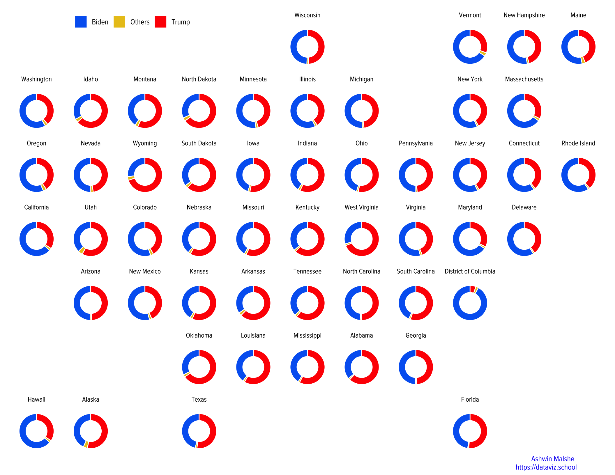
If you like it, save the plot using ggsave() function.
Method 2
In the second method, I will use geom_rect to add rectangles first and then use polar coordinates to create a pie chart. Once again he limits specified inside xlim() will convert it into a donut chart.
g2 <- dt2 %>%
  group_by(state) %>%
  arrange(Candidate) %>%
  mutate(ymax = cumsum(per_votes),
         ymin = ifelse(row_number() == 1, 0, lag(ymax)),
         ypos = (ymin + ymax) / 2,
         ypos = ifelse(state == "District of Columbia" & Candidate == "Trump",
                       0.05, ypos)) %>%
  ungroup() %>%
  ggplot(aes(ymin = ymin, ymax = ymax, xmin = 3, xmax = 4, fill = Candidate)) +
  geom_rect() +
  geom_text(x = 1.8,
             aes(y = ypos, label = formattable::percent(round(per_votes, 2), digits = 0)),
             size = 2) +
  coord_polar(theta = "y") +
  facet_geo(~state) +
  scale_fill_manual(values = c("#0066f2", "#e6f1fd", "#ff0000")) +
  theme_void()+
  xlim(-1, 4) +
  labs(caption = "Ashwin Malshe \nhttps://dataviz.school",
       subtitle = " ") +
  theme(legend.text = element_text(family = "proxima", size = 10),
        legend.title = element_blank(),
        legend.direction = "horizontal",
        legend.position = c(0.2, 1),
        plot.caption = element_text(family = "proxima", size = 10, hjust = 0.95,
                                    margin = margin(0, 0, 5, 0, "pt"),
                                    face = "bold", color = "#1500f4"),
        strip.text = element_text(family = "proxima", size = 9,
                                  margin = margin(0, 0, 5, 0, "pt")))


# Print the plot

g2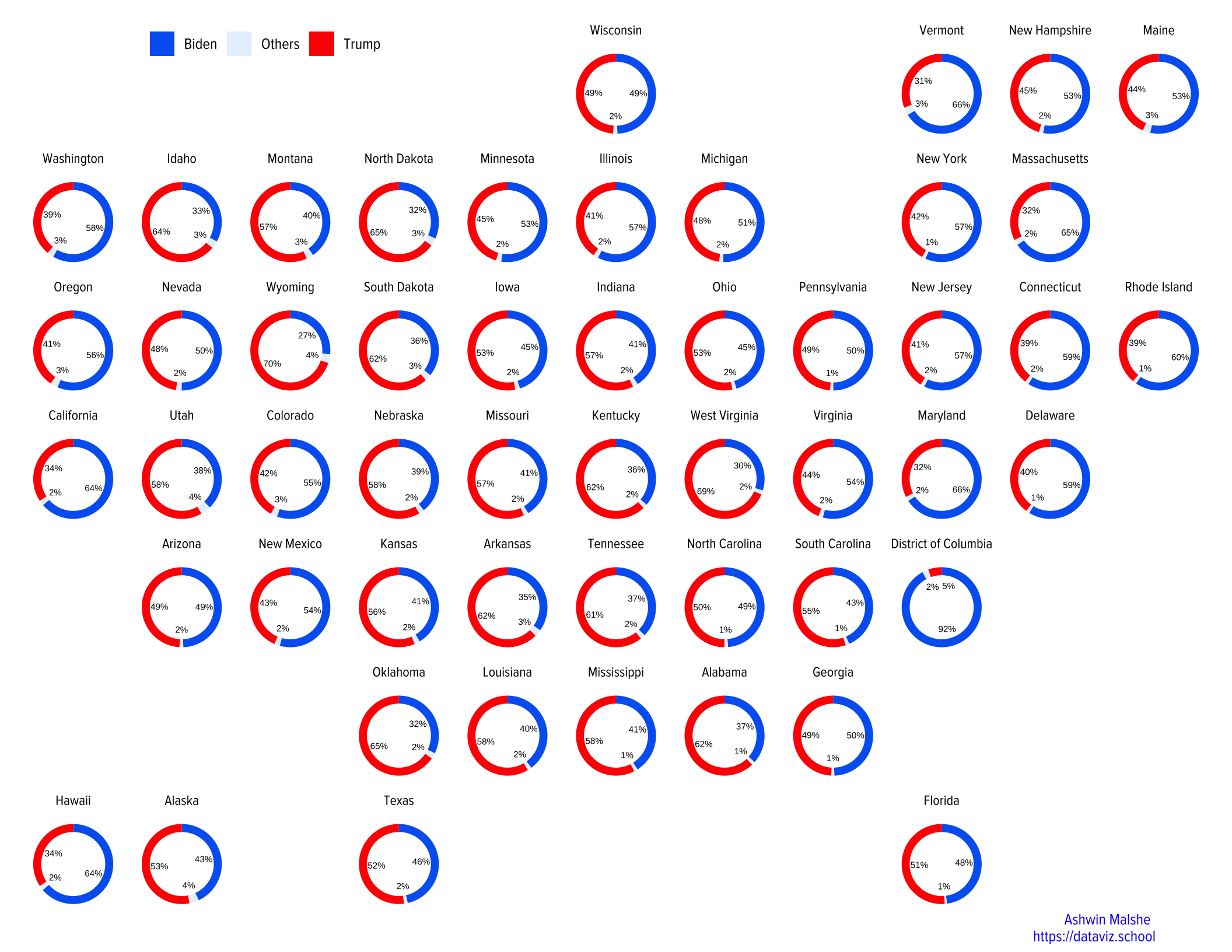
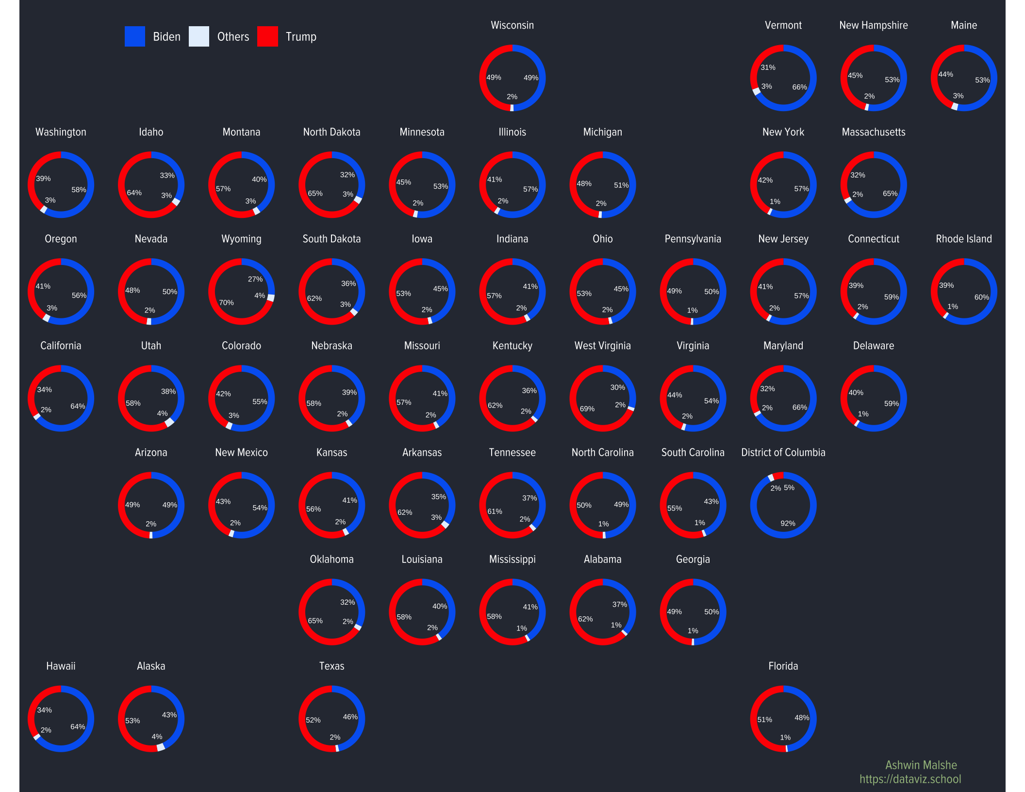
Another version of the same plot with a different background.
g3 <- dt2 %>%
  group_by(state) %>%
  arrange(Candidate) %>%
  mutate(ymax = cumsum(per_votes),
         ymin = ifelse(row_number() == 1, 0, lag(ymax)),
         ypos = (ymin + ymax) / 2,
                  ypos = ifelse(state == "District of Columbia" & Candidate == "Trump",
                       0.05, ypos)) %>%
  ungroup() %>%
  ggplot(aes(ymin = ymin, ymax = ymax, xmin = 3, xmax = 4, fill = Candidate)) +
  geom_rect() +
  geom_text(x = 1.8,
             aes(y = ypos,
                 label = formattable::percent(round(per_votes, 2), digits = 0)),
             size = 2, color = "white") +
  coord_polar(theta = "y") +
  facet_geo(~state) +
  scale_fill_manual(values = c("#0066f2", "#e6f1fd", "#ff0000")) +
  theme_void()+
  xlim(-1, 4) +
  labs(caption = "Ashwin Malshe \nhttps://dataviz.school",
       subtitle = " ") +
  theme(legend.text = element_text(family = "proxima", size = 10, color = "white"),
        legend.title = element_blank(),
        legend.direction = "horizontal",
        legend.position = c(0.2, 1),
        plot.caption = element_text(family = "proxima", size = 10, hjust = 0.95,
                                    margin = margin(0, 0, 5, 0, "pt"),
                                    face = "bold", color = "#a3be8c"),
        strip.text = element_text(family = "proxima", size = 9, color = "white",
                                  margin = margin(0, 0, 5, 0, "pt")),
        plot.background = element_rect(fill = "#2e3440", color = NA),
        panel.background = element_rect(fill = "#2e3440", color = NA) )


# Print the plot

g3